|
|
Post by adriansadlier on Jan 4, 2023 20:40:38 GMT

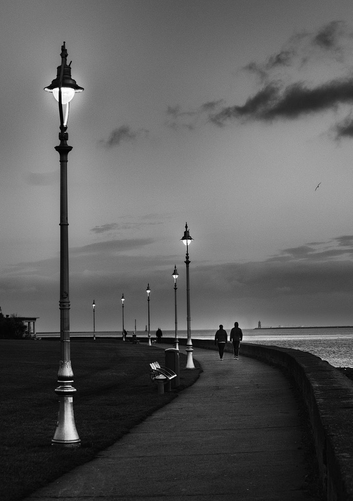
New Year, new(ish) camera. Nikon Zfc, 7Artisans 50mm f/0.95, manual focus, handheld. 1/160", ISO 400, somewhere around f8/f11 I have been trying to get a good shot on this promenade for a good few years now. Finally got the FoV and location right (I think) to give the best of the recession of the lights and the curve of the sea wall. What do you think? |
|
|
|
Post by andymcd on Jan 4, 2023 22:39:21 GMT
Your positioning looks impeccable to me, the lamps are all well separated and I like the sweep of the wall. The figures add to the scene too I think, they are well placed. Overall the picture is quite dark, but I'm not sure if that is just how it is showing on my monitor (I only enter print comps now at our club because of this). The lamp nearest looks like it has too much light halo at the top part - apologies if this is how it actually was (I am sensitive about halos having lost points many times due to them). Overall, I really like this and would be pleased if it was mine  |
|
|
|
Post by gray1720 on Jan 4, 2023 22:48:15 GMT
I like it very much as well - I think there might be a bit of a halo on the two walkers as well, but I'm sure it's splattable. I'm intrigued by the shiny bottoms to the lampposts!
|
|
|
|
Post by peterob on Jan 4, 2023 22:52:52 GMT
Works well.
|
|
|
|
Post by beatnik69 on Jan 5, 2023 13:54:52 GMT
Looks good, but I think the walkers have had their Ready Brek.
|
|
|
|
Post by Kath on Jan 5, 2023 15:27:30 GMT
I am distracted by the sloping sea and the haloes around the two people walking away from us and the lamposts but otherwise I like the composition.
|
|
|
|
Post by adriansadlier on Jan 7, 2023 1:52:22 GMT
Thank you for your response. As ever, I waited a while to gather the considered responses to my post. And I was not disappointed.
Yes, the horizon is off (I had not noticed it, but having it pointed out, I cannot ignore - or tolerate it).
The individuals who have had their "ready brek" need to be adjusted. It it the result of poor editing by me! The street lights highlight certain areas in the image - my editing has not reflected this.
The "brightness" in the bottom of the lamps is a result of the illumination of the lamps (not an editing artifact).
Thanks for the feedback and constructive criticism. I am glad that this forum follows the ethos of the AP forum - no bullshit allowed!
I will re-edit the image, based on the feedback (and my own interpretation), hopefully yielding a better result.
I think it is, basically a well composed and exposed image, that needs refinement. And I appreciate the feedback. It is what makes these forums useful.
Thank you
Adrian
|
|
|
|
Post by El Sid on Jan 11, 2023 13:25:10 GMT
Not over bothered by the sloping horizon - it's not that extreme and besides which the lamp posts appear to be properly vertical - but the apparent haloes are rather more troubling.
That said I do think you got the composition and overall exposure spot on.
|
|